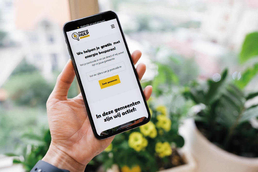
Minimalistic Design

Minimalism, Minimalist design, Minimal design, Minimal design, Minimalism in design, Reductive design
Minimalist design is a design approach where you keep only essential elements and omit all unnecessary visual noise. It increases conversion and loading speed.

What is minimalist design?

Minimalist design is a design approach where you deliberately omit all unnecessary elements, decorations and visual complexity. The goal is to achieve maximum impact with as few resources as possible. Every line, color and text element has a clear function. For an SME entrepreneur, this means faster load times, higher conversion rates and a more recognizable brand.

How minimalist design works in practice

Minimalist design follows a reductionist principle. You start with all the information you want to communicate and then delete anything that does not directly contribute to the main purpose of the page. Consider an ecommerce store product page: instead of ten different color areas, three fonts and a row of badges, you choose one accent color, one header and one call-to-action button. The space between elements, also called whitespace, is given an active role. It is not a void but a visual aid that directs attention. Users scan the page faster and find the most important information without mental strain. This increases the likelihood that they perform the desired action, such as a purchase or contact request.

Why minimalist design came about and why it matters now

Minimalist design has its roots in the Bauhaus movement and 1950s Swiss graphic design. At its core was functionality over decoration. In the digital world, this philosophy was reinvigorated starting in the 2000s with the rise of mobile devices. Small screens required simplicity: no room for superfluous elements. At the same time, the expectation of speed grew. Pages with a lot of visual clutter load slower and score lower in Google's Core Web Vitals. For Dutch SMEs, this is immediately noticeable. On average, an ecommerce store with a minimalist design loads one to two seconds faster than an overcrowded competitor, resulting in measurably fewer bounces.

What minimalist design delivers for SMEs

A minimalist design makes your brand more clearly recognizable. Visitors remember a simple visual identity better than a complex one. In addition, it increases conversion because you direct attention to one clear action per page. In practice, when clients switch to a minimalist design, we often see a 15 to 25 percent increase in click-through rates on landing pages. Maintenance also becomes easier: fewer elements means less code and less risk of visual inconsistencies. If you're considering redesigning your website, a professional web design process can help you strike the right balance between simplicity and functionality. After all, minimalist design requires sharp choices in user experience and visual hierarchy.
Applications of minimalist design

Minimalist design does not fit everywhere, but where it works it delivers measurable benefits. The trick is to recognize when less is really more and when, instead, you need context or emotion to persuade visitors. Below are four situations where minimalism proves its power and one where it's better to take a different approach.

Landing pages for targeted campaigns

A landing page with one goal, for example, signing up for a free SEO scan, benefits tremendously from minimalist design. You have a short headline, three to five bullet points with benefits, a form and a call-to-action button. No menu, no footer with ten links, no images that are distracting. Our trajectories show that SMBs with a targeted offer can increase their conversion rate from an average of 2 percent to 5 to 8 percent by removing all non-essential elements. The visitor does not have to choose between ten different actions. He sees the value and clicks through or leaves the page. This is clear for both parties.

Ecommerce stores with a highly defined assortment

For an ecommerce store selling 20 to 100 products with clear categories, minimalist design works great. Think of an ecommerce store in designer furniture or handmade ceramics. Large product photos, lots of white space, subtle typography and an eye-catching order button. No banners, no pop-ups, no carousel with offers. The product is the focus. Customers perceive this as professional and reliable. Note: this does not work as well for ecommerce stores with thousands of products and complex filters. There you need more visual structure and navigational elements. A well-designed ecommerce store always takes into account the nature of the assortment and the buying behavior of the target group.

Brand pages and portfolio websites.

When presenting yourself or your agency, minimalist design is a powerful tool to exude authority. A portfolio website with large images, little text and clear navigation shows that you trust the quality of your work. No explanations needed, no sales pitches. This works well for architects, photographers, design firms and strategic consultants. The visitor scrolls through your projects and quickly forms an opinion. At Monkey Vision , we apply this in our own branding projects: fewer elements force you to choose more sharply what you show. This strengthens brand identity and makes you distinctive.

When minimalist design is the right choice and when it is not

Minimalist design works best when your target audience already knows what you offer and wants to act quickly. Think repeat customers, targeted campaigns or niche market offerings. It doesn't work if you need to explain complex services or if your target audience needs reassurance through lots of information. For example, a financial consultancy comparing mortgages needs more text, tables and explanations than a landing page for a workshop. Even in ecommerce with many varieties, sizes and colors, too little information leads to ambiguity and higher return rates. The rule of thumb: if the visitor is in doubt, he needs context. Minimalism works only if the choice is clear.

Want to apply this to your business? Monkey Vision helps SME entrepreneurs with web design, SEO and smart digital solutions. Schedule a no-obligation meeting and find out what's possible for you.

Schedule an introduction

Frequently Asked Questions

No, although both approaches are related. Minimalist design is about leaving out unnecessary elements and focusing on essence and function. Flat design is a visual style within minimalist design where you avoid shadows, gradients and 3D effects. So you can have a minimalist design with subtle shadows or textures, as long as each element has a clear function. Flat design is always minimalist, but minimalist design does not always have to be completely flat. In practice, we see that SMEs often choose a hybrid form: minimalist in structure, with subtle visual touches for recognition and accessibility.

It depends on your product and the stage your customer is in. Minimalist design works well if your target audience is already familiar with your offering and wants to act quickly. Storytelling design, with more visual layers and emotional content, fits better when introducing a new brand or explaining complex services. A B2B software company often needs more context than an ecommerce store in designer accessories. In practice, we combine both: a minimalist framework with targeted storytelling in places where it makes a difference, such as the homepage or an about page. That way you maintain speed and clarity without losing emotional impact.

Start with an audit of your current site. Go page by page to see which elements really contribute to your main goal and which distract. Remove anything that doesn't directly help: redundant menu items, decorative images with no function, too many color variations. Choose one primary action per page and make it visually dominant. Increase white space between sections and limit your typography to no more than two fonts. Test the result with a small group of users and measure whether conversion improves. Note that minimalist design requires sharper copywriting because you have less space to make your point. Every sentence must count.

The best first step depends on your current website and goals. Already have a site but don't know if minimalism fits your target audience? Then schedule a free 30-minute design scan at Monkey Vision. We walk through your site live and give you three concrete points of improvement: which elements can be removed, where you need more context and how to use white space strategically. You also get an honest assessment of whether minimalist design fits your industry and conversion goals. Not a sales pitch, but practical advice based on years of experience with SME websites. Check out our web design approach or contact us directly for a scan.

About the author

Monkey Vision

Monkey Vision is a full-service digital agency at Nijmegen, specializing in web design, SEO, and AI automation for small and medium-sized businesses. The knowledge base has been compiled by our team of online strategists and is continuously updated based on current insights.

Publication date: 26-04-2026
Last update: 26-04-2026