Iconography

Icons, Icons, Symbols, Icon design, Icon set, Visual symbols
Iconography is the consistent use of icons and symbols within a visual identity. It reinforces navigation and brand recognition.

What is iconography?

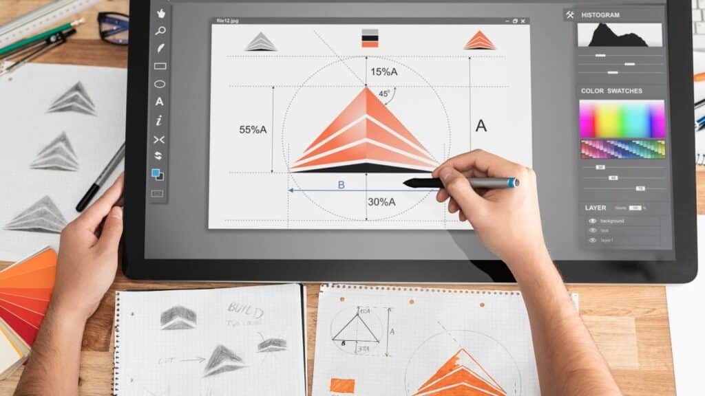
Iconography is the systematic design and application of icons within a visual identity. It involves a coherent system of icons that share the same formal language, line thickness and style. Well-designed iconography makes complex information understandable at a glance and reinforces your brand's recognizability. For SMEs, this means faster navigation on websites, clearer instructions in apps and a more professional look in presentations.

How iconography works in practice

An icon set consists of multiple icons created according to fixed design rules. Think of a uniform line thickness of 2 pixels, rounded corners of 2 pixels and a fixed canvas of 24x24 pixels per icon. You record these rules in a corporate identity manual or design system. This way, anyone in your organization can add new icons without losing visual coherence. In practice, with SME clients we often see that icons are created per department or per project, without central agreements. The result is a patchwork of styles that confuse rather than help the user. A good iconography system prevents this by establishing the ground rules in advance.

Why iconography is becoming increasingly important

Icons are not a new invention, but their role has changed. Where they used to be mainly decorative, they now carry meaning and functionality. Users no longer scan websites line by line, but look for visual anchor points. A shopping cart icon everyone recognizes immediately, a text link "ordering process" requires more cognitive effort. According to W3C's Web Content Accessibility Guidelines (WCAG), icons should always be combined with text labels or alt text, so that even screen readers can interpret them. At a time when companies are serving more and more digital channels, from app to ecommerce store to customer portal, a consistent iconography system ensures that your brand remains recognizable everywhere.

What iconography brings to your business

A well-thought-out iconography system lowers the cognitive load on your users. They understand more quickly where to click, what action a button performs and what information belongs together. This leads to shorter search times, fewer click errors and higher conversion. In a website design for a Dutch wholesaler, we saw that replacing text buttons with recognizable icons reduced the time to first order by 18%. In addition, iconography strengthens your brand identity. Unique icons distinguish you from competitors who use standard icon packs. Think of the rounded, playful icons of Mailchimp or the sleek, geometric icons of Dropbox. Iconography also helps with internal processes: in a dashboard or CRM system, icons make it clear at a glance which status an order has or which action is required.

Applications of iconography

Iconography appears in virtually every digital contact moment. The question is not whether you use icons, but whether you use them consistently and strategically. Below are four concrete application areas in which a well thought-out iconography system makes the difference for SMEs.

Navigation and menu structure on websites

Icons in a main menu or footer lower the threshold for clicking. A house icon for the homepage, an envelope for contact, a magnifying glass for search: these are universal symbols that need no explanation. In mobile menus, where space is scarce, icons often replace whole words. Just be careful: never use icons without a text label or aria label. Google research shows that icons without textual context hurt findability in search engines. At an ecommerce store with 400 products, we saw that adding category icons in the filter menu increased the click rate on filters by 23%. Users needed less time to find the right product group.

Job indication in ecommerce stores and platforms.

In ecommerce, icons are essential for quick decisions. A heart for favorites, a shopping cart for add, a checkmark for availability: these icons guide the user through the ordering process. For B2B platforms with complex configurations, icons are even more valuable. Consider a tech wholesaler where customers assemble products from hundreds of options. Icons for "compatible," "in stock," "Express delivery" and "request a quote" make the difference between an aborted session and an order. A common mistake is using icons that are too abstract. An icon for 'download invoice' should be recognizable, a generic download arrow works better than a stylized document folder. Always test icons with real users before implementing them in your ecommerce store.

Data visualization in dashboards and reports.

Dashboards and analytics tools use icons to indicate status, trends and actions. A green check mark for "goal achieved," a red exclamation point for "action required," an up arrow for "rising trend": these visual cues make reports scannable. For SMBs working with multiple stakeholders, from financial to operational, icons ensure that everyone reads the same information in the same way. In a dashboard for a logistics company, we replaced textual statuses with color-coded icons. The result: employees recognized deviations 40% faster and were able to adjust more actively. It is important that you use icons not only decoratively, but that they always have a clear meaning that is explained in the legend.

Brand identity and visual differentiation.

Unique icons strengthen your brand identity and differentiate you from competitors. Standard icon packs such as Font Awesome or Material Icons are functional, but make your brand interchangeable. A custom designed icon set aligns with your brand identity and tells the same story as your logo, typography and color usage. For a sustainable energy company, we developed icons with organic, flowing lines that emphasized the natural origins of their services. This contrasted with the angular, technical icons of competitors and reinforced their positioning as an accessible, people-oriented provider. Designing a custom icon set takes more time than downloading a free pack, but delivers brand value that lasts for years.

When iconography is the right choice and when it is not

Iconography works best in situations where speed and recognizability are crucial: navigation, ecommerce, dashboards and mobile interfaces. It is less suitable for complex, new or abstract concepts that require explanation. An icon for "blockchain integration" or "GDPR compliance" won't tell most users anything without a textual explanation. In those cases, a clear headline with a brief explanation is more effective. Also, for target groups with low digital skills or older users, text labels often work better than icons alone. So use iconography strategically: where it adds speed and recognition, not as decoration or because it looks modern.

Want to apply this to your business? Monkey Vision helps SME entrepreneurs with web design, SEO and smart digital solutions. Schedule a no-obligation meeting and find out what's possible for you.

Schedule an introduction

Frequently Asked Questions

No, iconography and a logo are two different parts of your visual identity. A logo is the central mark that identifies your company, often a combination of symbol and typography. Iconography is a system of multiple icons that together form a coherent formal language and convey functional information. Your logo appears in your header and on your business card, icons are used in menus, dashboards and product pages. However, they often share the same design principles: line thickness, use of color and style. A good design system connects logo and iconography so they reinforce rather than contradict each other.

A standard icon pack such as Font Awesome or Material Icons is fast, free and immediately usable. This is a good choice if your budget is limited, you want to launch quickly or your website is mainly functional without strong brand ambition. Custom icons are designed if your brand wants to stand out visually, if you have specific functionalities that standard icons don't cover, or if you want to match iconography to your existing brand identity. For a B2B service provider with 15 employees and a standard WordPress site, an existing pack is often sufficient. For a scale-up with growth strategy and brand ambition, a custom set is an investment that pays off in recognition and conversion.

Start with an inventory of all the places you now use icons: website, app, presentations, dashboards. Analyze whether they are consistent in style, format and meaning. Then make a list of all the icons you need, grouped by function (navigation, actions, status, categories). Determine your design rules: line width, corner radius, use of color, canvas size. If you don't have an in-house designer, work with an agency that combines brand identity and web design. They can design your icon set and implement it directly into your website or platform. Document your iconography system in a style guide so that future icons are created according to the same rules.

The best approach depends on your current situation and ambitions. Are you currently using random icons without consistency, or do you have no icons at all while your website is complex? Then schedule a free 30-minute UX scan at Monkey Vision. We will walk through your site live and show you where iconography can improve the user experience. You immediately get three concrete points of improvement plus an estimate of the impact on conversion and brand experience. No sales pitch, just practical advice on how iconography fits into your web design strategy.

About the author

Monkey Vision

Monkey Vision is a full-service digital agency at Nijmegen, specializing in web design, SEO, and AI automation for small and medium-sized businesses. The knowledge base has been compiled by our team of online strategists and is continuously updated based on current insights.

Publication date: 26-04-2026
Last update: 26-04-2026