Brand Identity Examples

Branding examples, Corporate identity examples, Corporate identity examples, Visual identity examples, Brand identity examples, CI examples
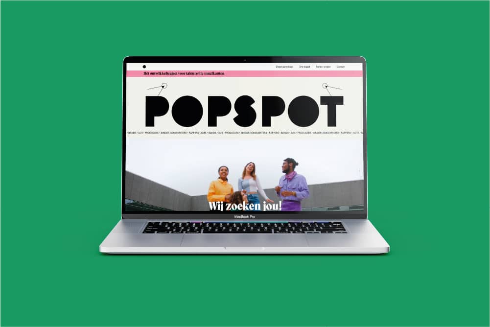
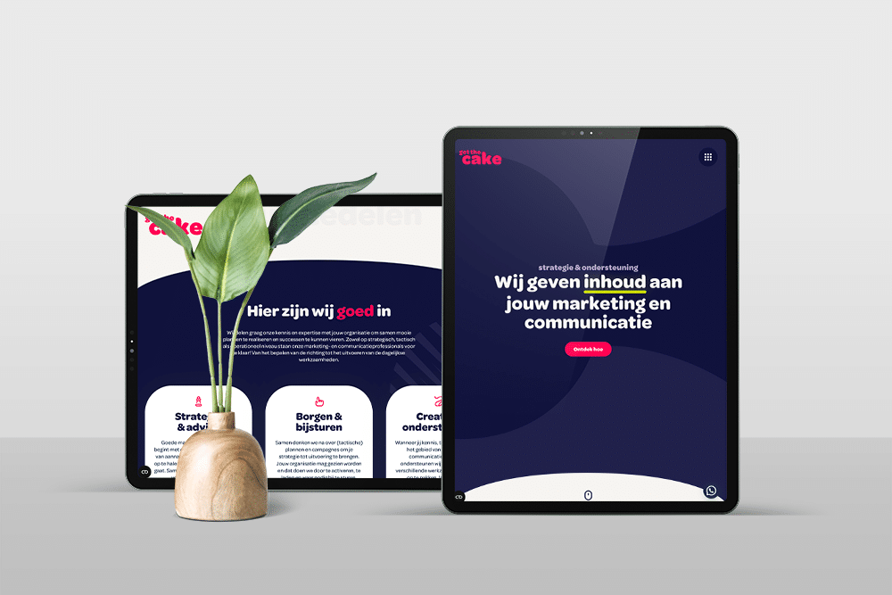
Corporate identity examples show how other companies shape their visual identity with logo, color, typography and style elements. They help guide design choices.

What are brand identity examples?

Brand identity examples are concrete cases of visual identities that other companies have developed. They show how logo, color palette, typography, visual style and design come together to form a recognizable whole. For Dutch SME entrepreneurs who want to develop a new brand identity or renew their existing identity, these examples provide guidance on design choices and direction.

What do brand identity examples consist of

A good corporate identity example shows more than just a nice logo. You see the complete system: the logo in different formats and contexts, the chosen colors with exact values, the typography for headlines and running text, the photo style or illustrations, and the application on business cards, website, packaging or social media. In Dutch SMEs, you often see practical applications such as offer templates, email signatures and Instagram posts. These concrete elaborations make it clear whether a style is actually workable in daily practice. A brand identity that is only beautiful in a presentation but not applicable to invoices or workwear misses the mark. Therefore, examples are valuable that also show implementation.

Why brand identity examples help with design choices

Many entrepreneurs struggle with abstract design concepts. What does it really mean when a designer says your brand should look "approachable but professional"? Examples translate that abstraction into concrete visual choices. For example, you see that accessibility can mean round fonts, friendly colors like soft blue or warm orange, and photos of real people rather than stock photos. Or you discover that professionalism in one industry requires clean lines and dark colors, while in another it requires brightness and white. By looking at examples from your own sector or with similar audiences, you get a realistic picture of what works. This will prevent you from choosing a style that may be beautiful, but does not match what your customers expect or recognize.

How brand identity examples contribute to a strong brand identity

Having a thoughtful brand identity design often starts with an inspiration phase. Examples help you articulate what you do and don't want. At Monkey Vision we see that clients often come in with vague wishes: 'modern' or 'fresh'. By going through examples together, it quickly becomes clear whether someone means: sleek minimalist like tech startups, or playful and colorful like creative service providers. That clarity speeds up the design process and prevents disappointment. Moreover, examples teach you which style elements really make a difference. Sometimes it's the unique color combination, sometimes the way a company uses its photography, and sometimes the consistency with which each point of expression speaks the same formal language. By recognizing these patterns, you can focus on what makes your brand identity strong and recognizable.


Applications of brand identity examples

Brand identity examples are not a passive source of inspiration. You actively use them at various stages of your branding journey: when briefing a designer, when coordinating internally with your team, and when validating concepts before making final choices.

Brief and set direction for new design

When hiring a designer or agency, examples help make your needs concrete. Instead of saying "I want something fresh," show three examples and explain what appeals to you about them: the light color scheme, the open typography, or just the playful illustrations. That gives the designer immediate direction. At Monkey Vision , we always ask clients to share five examples: three that they like and two that they want to avoid. The latter category is at least as valuable. An example of a competitor with a too formal look, or a brand identity that looks too busy, immediately makes it clear where the boundaries are. That way you avoid starting the design process with assumptions that are not correct, and you save revision rounds.

Internal alignment within your team or with stakeholders

When working with multiple decision makers, different visions of what brand identity should look like often arise. One partner wants sleek and businesslike, the other wants warm and approachable. Examples help to have that discussion visually. You put three directions side by side: a clean corporate style, an accessible friendly style, and a creative quirky style. By discussing which one best suits your customers, your services and your ambitions, you arrive at a supported choice. An ecommerce store with 800 products and a business target audience is likely to choose differently than a sole proprietor giving creative workshops. Examples make that difference tangible. They also force you to think about applicability: a playful handwritten style might be nice for Instagram, but will it work on a โ‚ฌ25,000 quote?

Validating designs during the design process

During the design process, you will be shown concepts. Examples help you evaluate them. You compare not to copy, but to check if your design is as strong, consistent and applicable as the examples you admire. Does your concept lack a clear color palette hierarchy? Are the fonts less legible than in the examples? Is a clear visual style missing? By developing that critical eye, you can provide more focused feedback. In practice, we often see that a first draft still lacks cohesion. The colors are nice, the logo is strong, but the typography doesn't fit. By referring to an example where it does fit, you can make concrete what you mean. That makes the conversation with the designer more effective and the end result stronger.

When brand identity examples are the right choice and when they are not

Examples are valuable if you are looking for direction, want to validate choices, or need internal alignment. They are less useful if you want to copy them verbatim. A brand identity that works perfectly for another company does not automatically fit your brand. The context is different: different target audience, different services, different brand personality. So use examples as a compass, not a blueprint. Also pay attention to the source: examples from international design awards often show experimental concepts that are not workable in Dutch SME practice. Rather, choose examples from companies with a similar scale, target group or industry. And be critical: a nice portfolio item is not always a successful brand identity in practice. Ask yourself whether the style still feels fresh after three years, whether it is scalable to new applications, and whether your team can work with it without calling in a designer each time.

Want to apply this to your business? Monkey Vision helps SME entrepreneurs with web design, SEO and smart digital solutions. Schedule a no-obligation meeting and find out what's possible for you.

Schedule an introduction

Frequently Asked Questions

No, brand identity examples are not templates you can copy directly. An example shows how another company has designed its visual identity: the choices, the consistency, the application. A template is a ready-made design that you customize with your own name and colors. Examples serve as inspiration and reference to develop your own unique brand identity. They help you understand what elements make up a strong identity and how those elements work together. A template provides a superficial solution; a good example teaches you the underlying principles. For SMBs that are serious about investing in their brand, a custom developed brand identity is always stronger than a custom template because it matches your specific target audience, positioning and ambitions.

Both have value, but with a different function. Examples from your own sector show what the visual codes and expectations are. In construction you often see bold colors and tight typography, in healthcare soft tones and accessible imagery. Ignoring those sector conventions is risky: your clients are less likely to recognize you as a relevant provider. Examples outside your sector offer refreshment and prevent your brand identity from becoming a copy of your competitors. A law firm that draws inspiration from the creative sector can add just that bit of quirkiness that sets it apart without losing credibility. In practice, a mix works best: look at three examples from your sector to understand the basics, and two examples from other sectors to find unique touches.

The biggest mistake is copying elements verbatim without thinking about context. A certain color works for a hip coffee concept, but not for a financial advisor. A playful illustration style suits a childcare center, but not an IT security company. A second mistake is trying to combine too many examples at once: the logo of company A, the colors of company B, the typography of company C. This does not produce a cohesive identity. A third pitfall is looking only at award-winning examples. These are often conceptually strong but practically less workable. They require specialized knowledge to apply and are sometimes too daring for an SME target group. So choose examples that fit your scale and ambitions, not just your aesthetic preferences.

Start by collecting ten to fifteen examples that appeal to you, and analyze why. Is it the color choice, the simplicity, the consistency, or the way photography was used? Share that analysis with your team or designer and translate it to your own brand: which of those elements fit your target audience and positioning? Schedule a free 45-minute brand exploration at Monkey Vision. We'll go through your examples, mirror them against your ambitions and immediately give you three directions that fit your business. You'll get an honest assessment of what's achievable within your budget and timeline, and concrete next steps to get from inspiration to a workable brand identity.

About the author

Monkey Vision

Monkey Vision is a full-service digital agency at Nijmegen, specializing in web design, SEO, and AI automation for small and medium-sized businesses. The knowledge base has been compiled by our team of online strategists and is continuously updated based on current insights.

Publication date: 26-04-2026
Last update: 26-04-2026